Architecture
LOCATION
Electronic City Banglore
PROJECT AREA
5000 sq.ft
STATUS
Completed (2022)
TYPE OF PROJECT
Residence
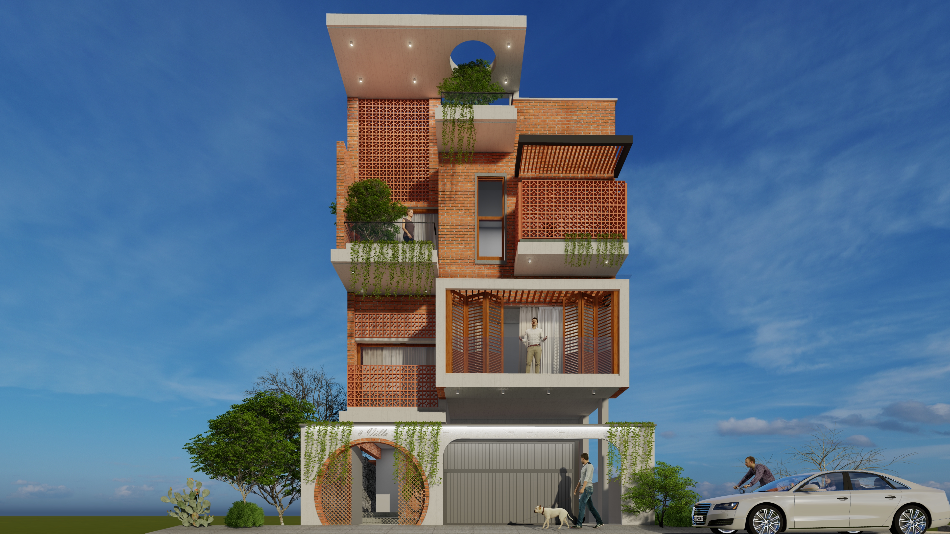
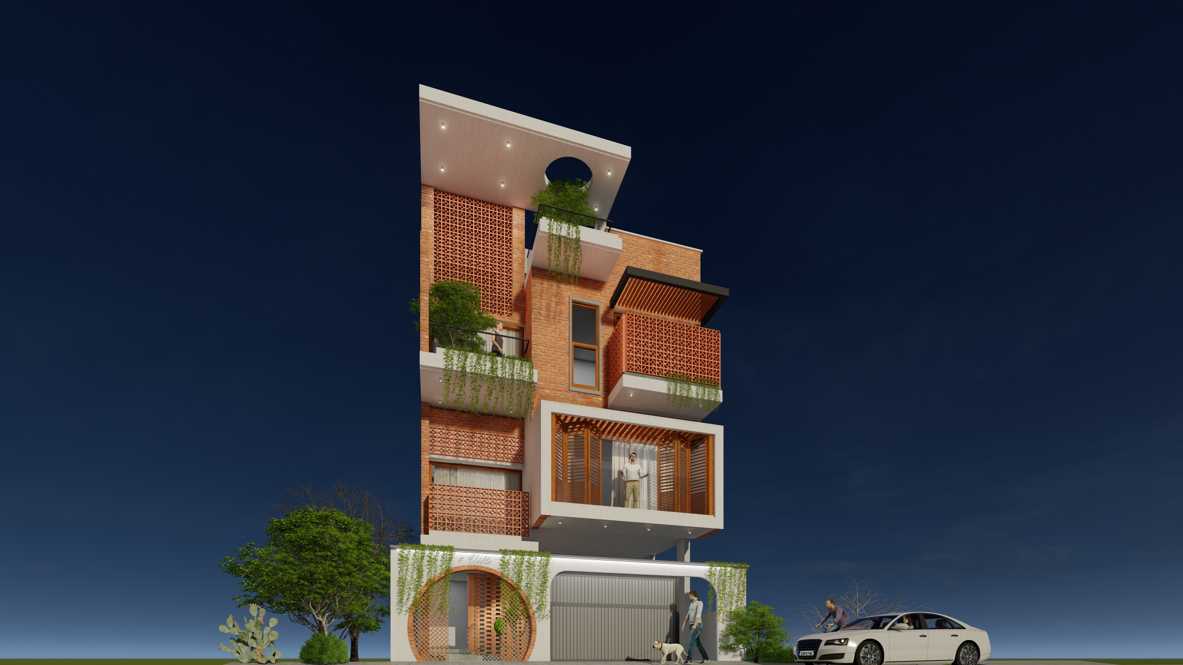
One of the most striking features of the building is the brick jalli railing that lines the perimeter of the mezzanine level. The use of brick in this way adds a sense of texture and pattern to the building's exterior, while also providing privacy and security for those on the mezzanine level.
The mezzanine itself is another key architectural feature, providing additional square footage while also adding visual interest to the building's exterior. The mezzanine level is carefully proportioned, with a height that complements the scale of the rest of the building.
The brick facade of the building is another key element, providing a sense of solidity and permanence. The brick is carefully laid in a pattern that emphasizes the horizontal lines of the building, adding a sense of visual interest and rhythm to the exterior.
The entry compound wall is another important architectural element, providing a sense of privacy and security while also serving as a transition space between the exterior and interior. The wall is carefully proportioned, with a height that provides a sense of enclosure without feeling oppressive.
Overall, this building showcases a thoughtful and carefully designed exterior that emphasizes texture, pattern, and proportionality. The use of brick, mezzanine levels, and compound walls all add interest and complexity to the building's exterior, while also serving important functional purposes.
In addition to the architectural features mentioned above, the building also incorporates a number of carefully considered design details. The windows, for example, are carefully placed to provide ample natural light while also ensuring privacy and security for those inside the building. The use of dark metal frames around the windows and entry door provides a sense of contrast against the warm tones of the brick facade, creating a visually striking effect.
The building's proportions are carefully considered, with the various elements of the building arranged in a way that creates a sense of balance and harmony. The mezzanine level, for example, is set back from the rest of the building in a way that creates a sense of depth and dimensionality, while the compound wall is aligned with the building's entrance to create a sense of symmetry and order.
The use of brick as the primary building material not only adds texture and visual interest to the exterior, but also creates a sense of connection with the surrounding context. The warm tones of the brick help the building blend in with its natural surroundings, while also conveying a sense of solidity and durability.
Overall, this building is a beautiful example of thoughtful, well-executed architectural design. The careful attention to detail, use of high-quality materials, and emphasis on proportionality and symmetry all work together to create an exterior that is both functional and aesthetically pleasing.

